

How to design a Facebook business page: avatar, cover, action button
Summary:
- In 2026 a Business Page is a first-screen funnel: avatar, cover, and CTA must align or impressions become wasted clicks.
- Avatar: square master, centered simplified mark, minimal micro-typography, strong contrast; allow padding for circle crop.
- Cover choice: pick the simplest asset that communicates on frame one—static, short video, or a lightweight sequence.
- Safe-zone: expect height loss on desktop and width loss on mobile; keep headline/hero in a central band; run mobile/desktop checks.
- Measure as an experiment: baseline CTA CTR, Page link clicks, and messaging share; freeze offer/landing/scripts for a week.
- For outcomes: site funnels track engaged sessions and first meaningful event reach; messaging track click→qualified reply and median reply time.
Definition
Facebook Business Page design in 2026 is treating the Page surface as the first funnel screen, where avatar, cover, and CTA act as one promise. In practice you design for safe-zone crops, route the CTA to a single primary scenario, ensure the first meaningful event is reachable fast (or a structured Messenger opener), then compare baseline vs after metrics like CTA CTR and click→qualified reply.
Table Of Contents
- What changes in Facebook Business Pages in 2026 for avatars, covers and the action button?
- Avatar fundamentals that always scale
- How do you choose between a static cover, video cover, or a lightweight sequence?
- Safe-zone thinking that prevents accidental crops
- CTA button strategy for media buying funnels
- Specification guide for 2026 assets
- Branding without friction or false promises
- Page narrative and user flow that match ad entry points
- Engineering nuances under the hood
- Frequent mistakes and how to fix them
- How do you test assets without burning budget?
- Terminology alignment for English-speaking audiences
- Production checklist for a ten-minute prelaunch review
If you are mapping the bigger picture of how budgets translate into results on Meta, start with a practical primer on Facebook media buying. A concise walkthrough is here — a practical look at how Facebook media buying actually works.
What changes in Facebook Business Pages in 2026 for avatars, covers and the action button?
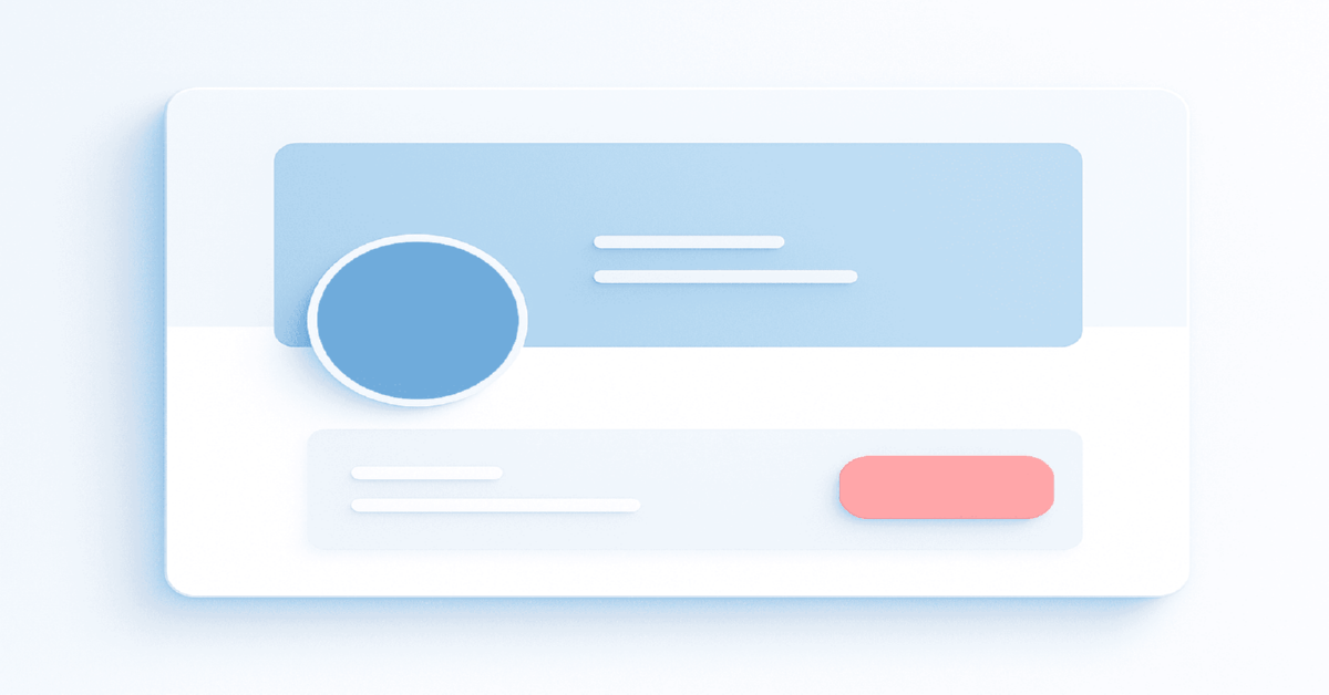
In 2026 a Business Page functions like a first-screen funnel: the avatar establishes identity, the cover sets context, and the action button moves people into a conversion path. The practical rule is clean graphics that survive every viewport, a coherent message, and a CTA that mirrors your media buying goal, otherwise impressions turn into wasted clicks.
Avatar fundamentals that always scale
The avatar must read as a circular stamp at small sizes, which means a square master image, a centered symbol, and minimal micro-typography. A single lettermark, monogram, or simplified mark carries better in mobile grids than a full wordmark. Contrast is your insurance policy; light symbols on dark or dark on light reduce bleed on mid-tone backgrounds. If the brand system is complex, produce a "micro" version specifically for the Page.
Edge safety is key because Facebook crops in a circle. Keep high-frequency detail within an inner circle that leaves generous breathing room. Test on both iOS and Android because varying pixel densities can soften strokes; when in doubt, thicken lines by ten to fifteen percent in the micro lockup so they survive compression.
How do you choose between a static cover, video cover, or a lightweight sequence?
Choose the simplest asset that can deliver the message on the first frame; a static cover is the most predictable, a short video adds motion for attention, a sequence of variations reveals facets of the offer. The deciding factor is load and clarity, not novelty. If the first frame of a video cannot work as a poster image, prefer a static cover.
For brands running content funnels, motion can preview product usage or social proof; for performance landing funnels, a static cover with one core promise aligns better with cold visitors arriving from ads. Avoid tiny captions and complex photo-collages; one subject, one benefit, one supporting visual is the resilient composition.
Planning to capture leads straight from the Page without sending users to a site? A helpful walkthrough on collecting contacts via native lead forms shows how to keep the flow lightweight. For reference, here is the direct link: https://npprteam.shop/en/articles/facebook/lead-forms-without-a-code-how-to-collect-contacts-directly-on-facebook/
Safe-zone thinking that prevents accidental crops
Design the cover as if you will lose some height on desktop and some width on mobile. Place headline, subline, and key object in a central band that remains visible after platform overlays and responsive trims. Assume the avatar and the action button will overlap edge areas; keep critical elements clear of the left edge and the lower third.
A useful habit is to export a "mobile check" with side trims and a "desktop check" with reduced height, then review on actual phones and laptops. If your headline still reads and your hero object remains centered, the asset is ready.
How to measure a Page redesign without guessing
A cover refresh only helps when you track it like an experiment. Before changing anything, log a baseline for CTA click-through, link clicks from the Page, and the share of visitors who start a conversation (for messaging flows). After the update, freeze other variables for a week: don’t swap the offer, landing, or scripts at the same time, or you will lose attribution.
For website-bound funnels, validate outcome quality, not just clicks: watch engaged sessions, the share of visitors who reach your first meaningful event, and how quickly they hit that event after arrival. For click-to-message, measure the conversion from click → first qualified reply and the median reply time; slow responses often cancel any visual gains. If metrics do not move, the usual cause is promise mismatch: your cover/CTA implies one next step, while the first screen of the chat or landing page delivers another.
CTA button strategy for media buying funnels
The action button should mirror the objective you optimize for: Send Message for chat-driven flows, Learn More for pre-qualified traffic to a site, Call Now for high-intent local services, Sign Up or Book Now for lead forms and appointments. Alignment reduces friction and clarifies what happens after the click, which improves click-through and intent quality.
If your paid campaigns push to Messenger, keep the Page button consistent so organic visitors join the same thread. If your cold traffic needs context before a form, point the button to an educational landing page, not a generic homepage. Treat the CTA label as a promise and make the destination deliver on it within the first screen.
For smoother ramp-up and testing, consider working with ready-to-run Facebook ad accounts when you need clean environments for split tests.
CTA, events, and the first 10 seconds after the click
A Page button is a promise, and the "first 10 seconds" is where intent quality is won or lost. If your CTA sends users to a site, make sure the first screen mirrors the same wording fragment as the cover and the top ad set, and that a single primary event is reachable fast. When the first meaningful event sits too deep, optimization receives weak signals, and you pay for traffic that never becomes learnable.
If the CTA sends users into Messenger, treat the first message as a funnel step: one short opener, two to three quick-choice options, and one qualifying question. This reduces empty chats and makes replies measurable. The practical rule is one CTA = one main scenario per period. Mixing "Learn More" to a page and "Send Message" expectations in the same week creates dead-end clicks and inflates costs, especially on cold traffic where clarity is the whole game.
A 30-second alignment check: cover promise, CTA path, first screen, primary event
Most performance drops happen because the Page tells one story while the next step tells another. A fast fix is to align four surfaces: cover promise → CTA path → first screen → primary event. The promise lives on the cover as a single idea, the CTA path matches the same intent, the first screen repeats that intent in different words, and the primary event is reachable without friction. If any link breaks, you buy clicks but feed the system weak signals.
Use this quick check before launch:
| Surface | What must be true | Fail symptom |
|---|---|---|
| Cover | One clear benefit, readable on mobile | High bounces after click |
| CTA | Matches the intended scenario for the week | Clicks with no downstream action |
| First screen | Confirms the promise within 3 seconds | Users hesitate or back out |
| Primary event | Reachable fast and measurable | Optimization stalls, cost inflates |
CTA selection matrix
This compact matrix relates funnel goals to button choices, with a risk note so you can pre-empt common drops.
| Funnel goal | Recommended CTA | Best when | Primary risk |
|---|---|---|---|
| Conversation first | Send Message | Fast triage, scripted replies, routing tags | Slow response time kills momentum |
| Educate then convert | Learn More | High-consideration products and services | Heavy pages cause early exits |
| Immediate booking | Book Now or Sign Up | Events, classes, trials, waitlists | Low lead quality without qualification |
| Local high intent | Call Now | Service areas with urgent needs | After-hours calls miss human pickup |
Specification guide for 2026 assets
Master files should be larger than displayed sizes to survive compression; keep critical content centered and text minimal. Use PNG for crisp logos and flat color, high-quality JPG for photography and gradients. Work in sRGB and avoid aggressive compression that creates banding in soft backgrounds.
Export a poster frame for any video cover that operates like a static cover. Add a subtle texture or film grain to reduce visible banding after platform re-encoding.
Data table: practical ranges to design against
These ranges are working references for production in 2026; they’re not laws, but they map well to real device behavior.
| Asset | Master size | Common display windows | Safe-zone note | Preferred format |
|---|---|---|---|---|
| Avatar | 720 × 720 or higher | Appears as a circle at small diameters | Keep symbol within inner circle with padding | PNG for logos |
| Cover | Wide master with central band focus | Wider crop on desktop, taller crop on mobile | Headline inside the central band, edges clean | JPG for photos, PNG for flat design |
| Video cover | Poster frame equals static cover clarity | Autoplay contexts vary by device | Message readable on first frame without audio | MP4 with conservative bitrate |
Branding without friction or false promises
Keep the cover benefit specific yet believable, avoid sensational before-after tropes, and steer clear of claim-heavy microcopy that breaks trust. A neutral background with a single focal object outperforms cluttered collages. If you include faces, use licensed imagery or original shoots to prevent rights disputes that derail campaigns.
Social proof belongs in the caption and in posts, not packed into the cover. Over-signaling money icons or urgency clocks looks spammy to both people and platform heuristics. Let typography and spacing do the heavy lifting; when the composition breathes, the message feels confident.
Trust and risk signals in 2026: what boosts complaints and how to neutralize it
In 2026, a Business Page is often the "trust checkpoint" for cold traffic: users land, scan the cover, avatar, and description, then decide whether to proceed. The biggest drivers of negative feedback are not technical settings but tone and cues: aggressive promises, exaggerated urgency, heavy money symbolism, and "too ad-like" copy on the cover. Even when nothing is explicitly forbidden, these patterns can spike reports, which harms quality signals and makes scaling less predictable.
A safer approach is simple: keep the cover to one benefit in neutral language, move details and conditions into pinned posts or the landing page, and avoid visual tropes that look like shortcuts. If you need proof, use restrained "numbers-only" credibility rather than dramatic before-and-after framing. Finally, treat image rights as non-negotiable: licensed or original assets reduce the risk of takedowns that can break campaign pacing mid-week.
Page narrative and user flow that match ad entry points
Make the first three seconds answer who you are, what you offer, and what happens next. Align Page name and category to search intent, let the cover echo the promise from your top-spending ad set, and route the CTA to the same destination as your primary campaign. Consistency shortens decision time and stabilizes intent quality.
Reorder Page sections so Reviews, Services, or Offers sit near the top if they advance your most common path. Trim outdated posts pinned above the fold; a recent evergreen explainer or a product overview is stronger than a sporadic announcement.
Engineering nuances under the hood
Think in zones, not pixels. Design for failure cases where cropping is less forgiving, compression is harsher, and overlays move. The most resilient covers keep the semantic core centered, reserve generous margins, and limit syllables in the headline. A readable five-to-seven-word headline beats a clever paragraph.
Compression on gradients often creates bands; add a soft noise layer or use a subtle textured background to mask banding. Sharpen logos slightly for export, then preview on a mid-range Android device to catch aliasing that high-end phones hide. If the asset passes the worst device, it will pass the best.
Comparative table: static vs video vs sequence
Use this comparison to pick the smallest sufficient tool for the job.
| Format | Strength | Weakness | Best use case |
|---|---|---|---|
| Static cover | Predictable quality and fastest production | Lower motion-driven attention | Landing funnels and evergreen positioning |
| Video cover | Motion preview of the product | First frame must communicate alone | Content funnels and demos |
| Sequence | Multiple facets in one surface | Users may not swipe or notice change | Seasonal offers and multi-SKU lines |
Expert tip from npprteam.shop: Design the cover as a radial composition, nudging contrast and detail toward the center; when crops shift between devices, the message still lands without manual variants.
Expert tip from npprteam.shop: Match the Page CTA with your highest-spend campaign objective for the week; this keeps organic clicks inside the same conversation and improves reply speed metrics in Messenger.
Frequent mistakes and how to fix them
Tiny headlines undermine readability on phones; rewrite to a single promise and increase size rather than adding a second line. Logo-heavy avatars collapse into noise at small diameters; switch to a simplified mark. CTA mismatch creates dead ends; if agents are offline, avoid Call Now and push to a form or message flow with automated replies.
Visual inconsistency between cover and ads introduces doubt; reuse color, headline token, or hero object so the leap from ad to Page feels inevitable. If performance dips after a visual refresh, roll back to the last known good composition and change one variable at a time.
Mini diagnostic table for quick triage
Use these concise mappings when troubleshooting after a traffic spike or redesign.
| Symptom | Likely cause | Fix |
|---|---|---|
| Low CTA clicks | CTA label and destination misaligned | Align label with outcome and verify first screen match |
| Headline cropped | Outside central safe-zone | Recenter and shorten to five-to-seven words |
| Brand looks fuzzy | Over-compressed or thin strokes | Export at higher quality and thicken strokes |
| Trust drop after click | Cover promise not reflected on landing | Mirror headline and hero across surfaces |
How do you test assets without burning budget?
Test with organic previews first, then run micro-spend traffic to a dark post variant and evaluate attention signals. You do not need a full split test to spot a weak cover; time-to-first-interaction in Messenger, scroll depth on the landing page, and first-reply time correlate with whether your surface message is clear.
Create a low-risk rotation: maintain one control cover and cycle a single variable in each experimental version. Keep a change log, date each export, and save a mobile and desktop check image so the team can revert without guesswork.
Terminology alignment for English-speaking audiences
Use media buying rather than arbitrage, impressions instead of delivery, click-through rate instead of tap rate unless you are in a mobile-only context. Be explicit when you mean messaging ads or click-to-message flows; clarity improves collaboration with cross-functional teams and external vendors.
When your Page targets mixed regions, prefer neutral spelling and avoid region-locked idioms in the cover headline. Keep legal and compliance claims off the cover; place them on the landing page where nuance and disclaimers live better.
Production checklist for a ten-minute prelaunch review
Open the Page on a mid-range Android phone and a typical laptop, then ask one question: does the first frame answer who, what, and what next without scrolling. If not, tighten the headline, recenter the subject, or swap the CTA. Only after that review should you trigger paid traffic, because poor first-frame clarity wastes cold impressions.
Finally, confirm that the button destination, the cover promise, and the top ad set share the same wording fragment. That single move reduces cognitive dissonance and improves the odds that the visitor recognizes the promise they clicked for and continues.

How to Analyze Competitors in Meta Ads Library in 2026
Why Ads Library remains a clear window into competitors strategies in 2026Ads Library exposes active and archived creatives, launch dates,...

Why is TikTok best suited for product promotion?
If you’re new to this channel and want the full picture first, start with a fundamentals overview of TikTok media...

What should I do if the money goes out quickly, but there are no applications in Facebook Ads?
New to the topic and want a clear baseline before troubleshooting? Start with a plain-English primer on how Facebook media...


